Environment Learning Platform.
About Glas
The issue of Climate Change is an out-dated issue, where people have primarily lost interest. Glas is a brand new initiative that attempts to stir a renewed form of attention and build “ecological literacy” among Irish school children between the ages 8 – 12.
The project explores eight main areas in the environment where this literacy could be improved: Air; Climate, Environment; Waste; Economy; Land; Water; and Nature. These areas are based on statistical research conducted by the Environmental Protection Agency (EPA). Aimed at the ease of use for both teachers and school children. Through vibrant, youthful design, we proposed to create a renewed form of awareness which moves away from “doom and gloom” mentality.

Typeface Design.
The word “Glas” is an Irish language name and when translated into English, simply means “Green.”
Not only is it a reference to our green environment, but also instills Irish identity into it. As one of the first things thought in primary schools, the word “Glas” is instantly recognizable among school children from the age 8-12.
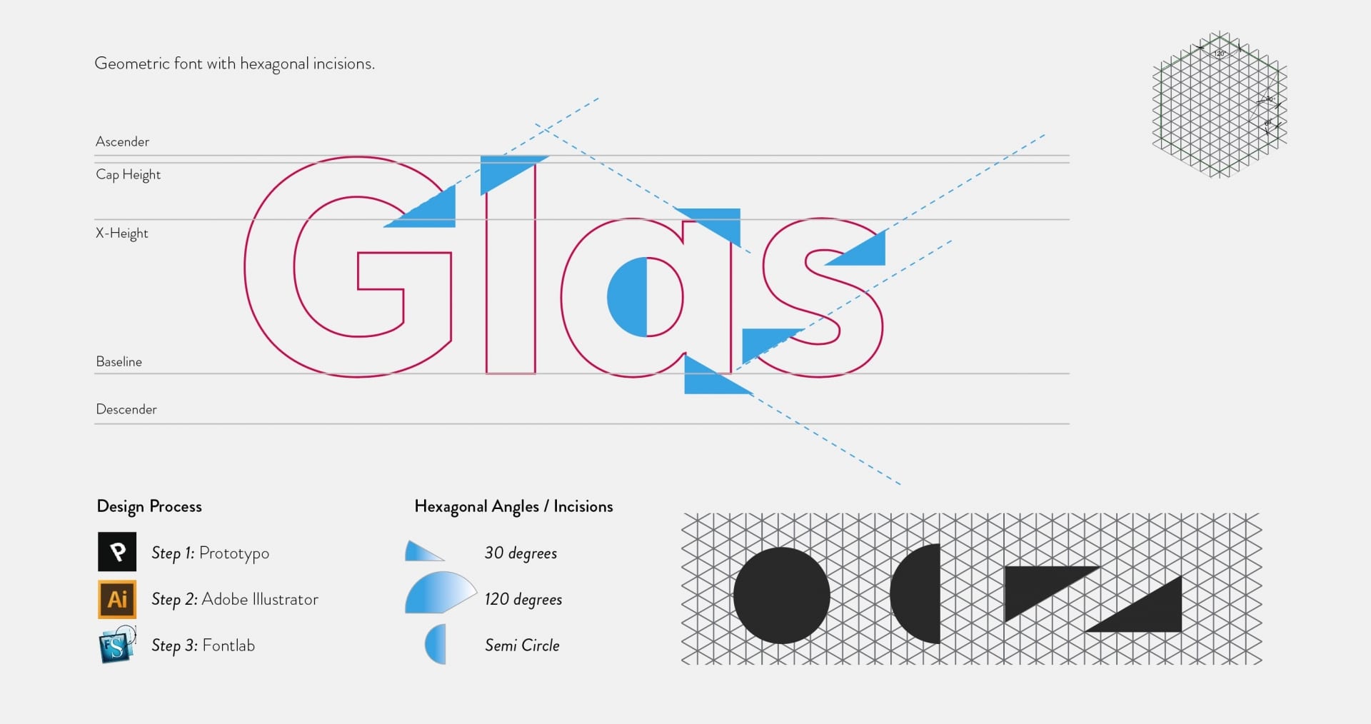
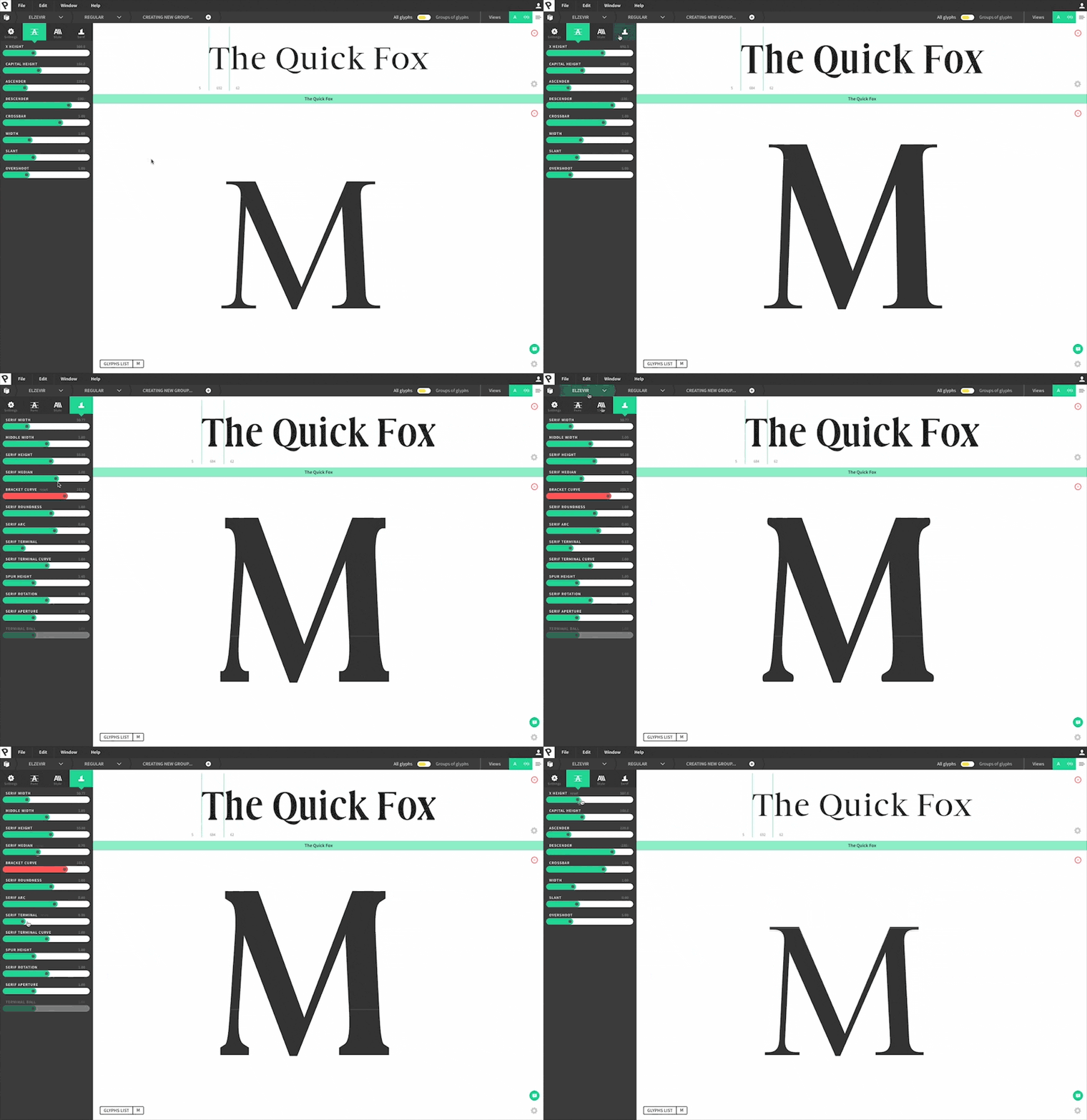
Since the client was attracted more towards a unique monotone logotype, this triggered the idea of creating a bespoke typeface for Glas. By adding an element of auteurship, Glas hopes to form a unique identity.
The result is a bespoke angled geometric font.

Dynamic Logotype Design.
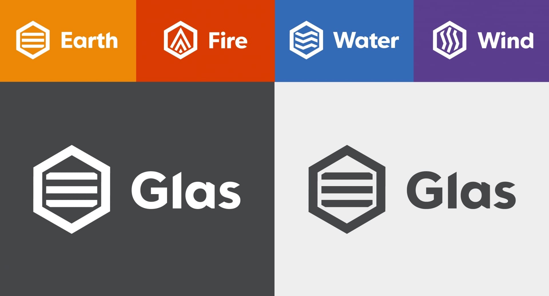
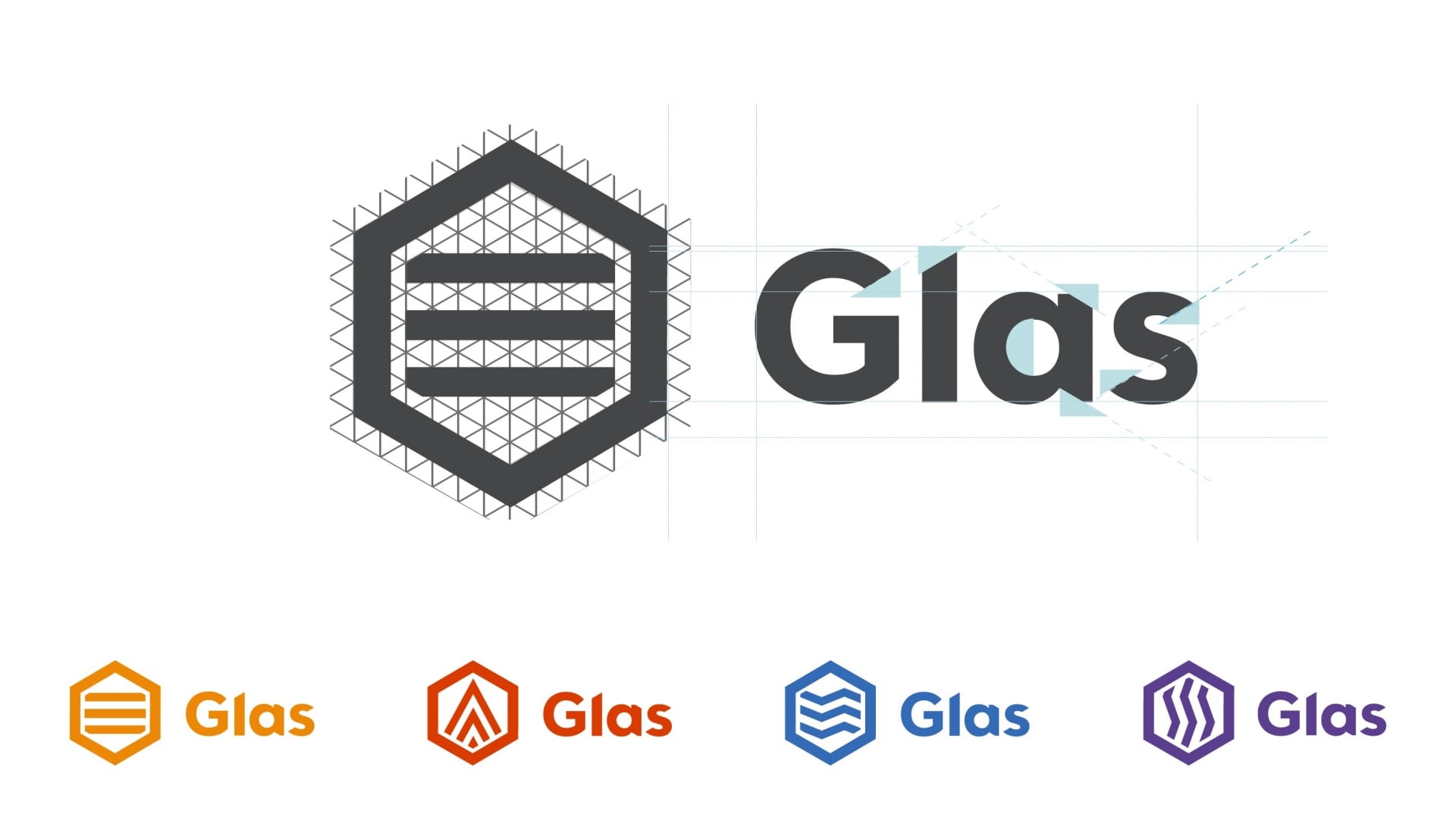
A dynamic logo is the one that has the ability to change its shape, color, and wording.
Dynamic Branding is an identity that can be changed, but has a basic element that always remains the same. Whether it is the word-mark, text/word itself, colours, or shape; the brand is still recognizable. Dynamic Branding is a way of giving your identity a fresh look without completely changing the identity.
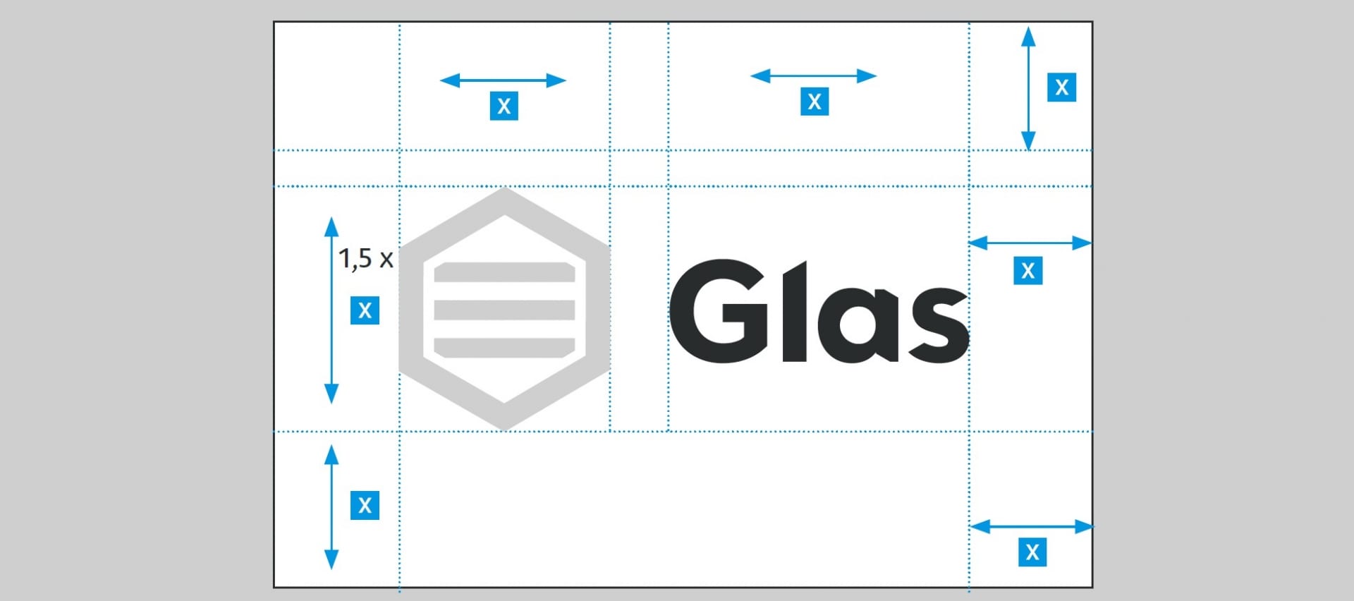
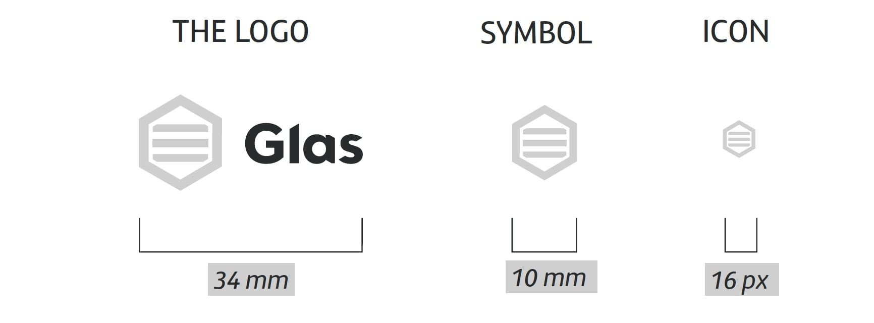
Similar to the primary logo, symbols were designed and created on the isometric grid using hexagonal shapes.
With a variety of platforms and media vehicles, designers not only have a challenge on new concepts such as varied expression forms, elements, principles, and aesthetic concepts, they also have to take into account users’ cognitive tendencies and social media aspects during the design thinking process, especially in trying to enhance the user experience. Dynamic identities aim to improve a traditionally static visual experience with a multi-dimensional angle.

Elearning Platform.
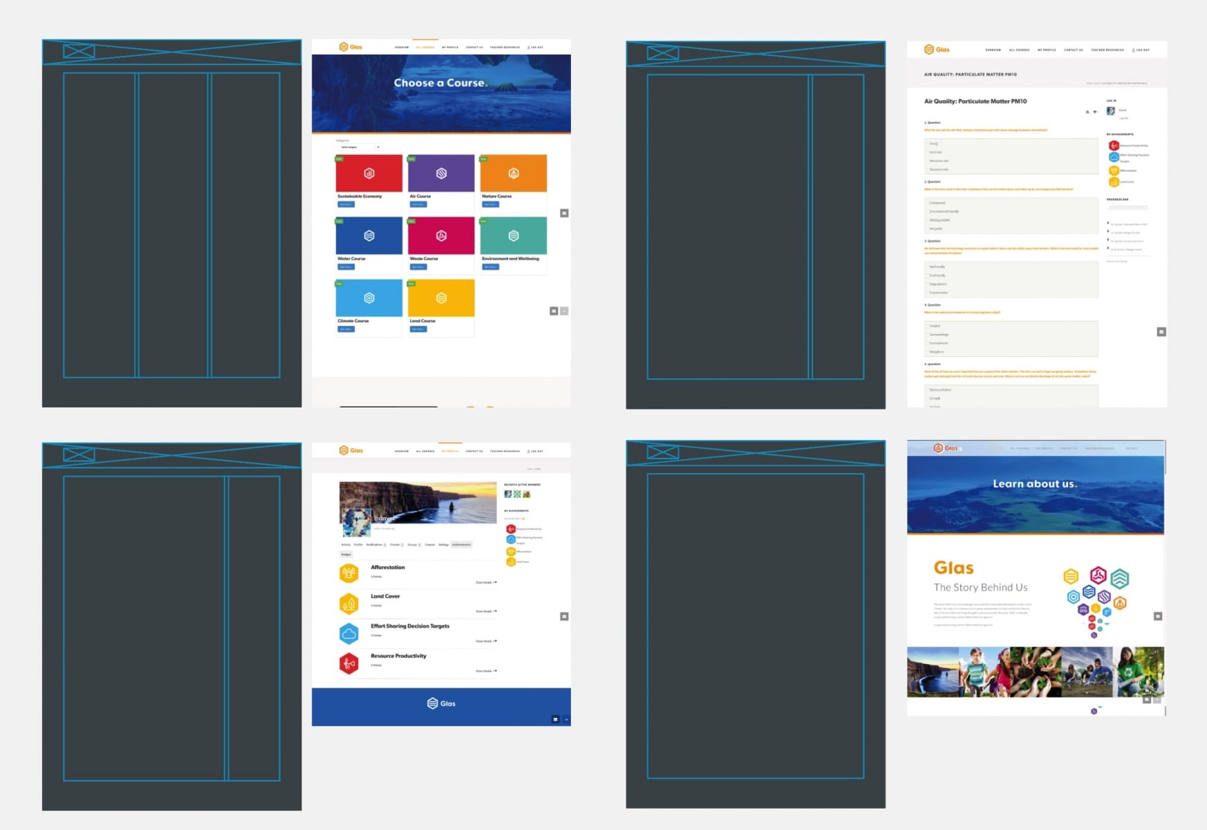
Creating a gamification learning platform is one of the latest trends in the eLearning community.
For those unfamiliar, gamification is the process of creating a set of course content that functions much like a game.
Gamification techniques endeavor to leverage people’s natural desires for competition, achievement, socializing, learning, mastery, self-expression, altruism, status, or closure. Early gamification strategies use awards for players who achieve desired assignments or competition to engage players.
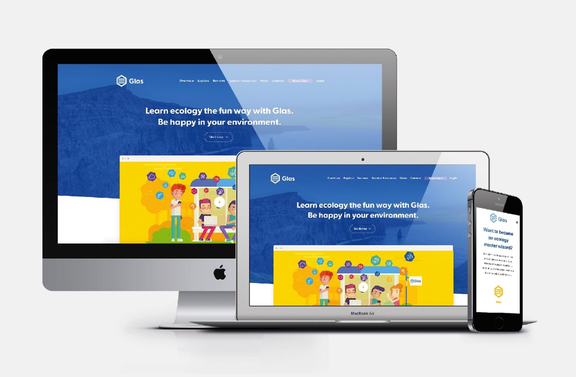
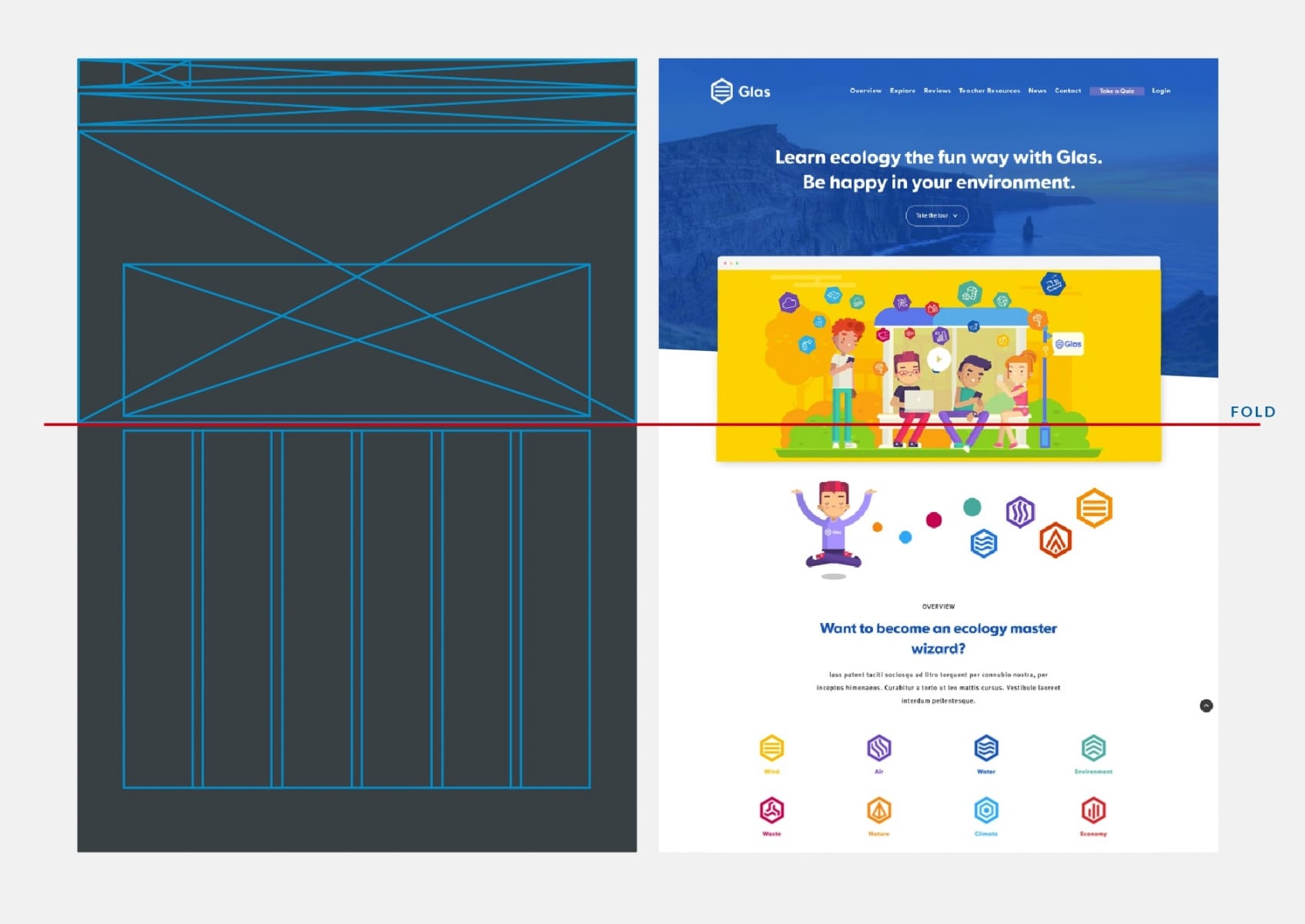
The end result is a bright, fresh and vibrant website design with big hero images and block style sections.
Video Explainer.
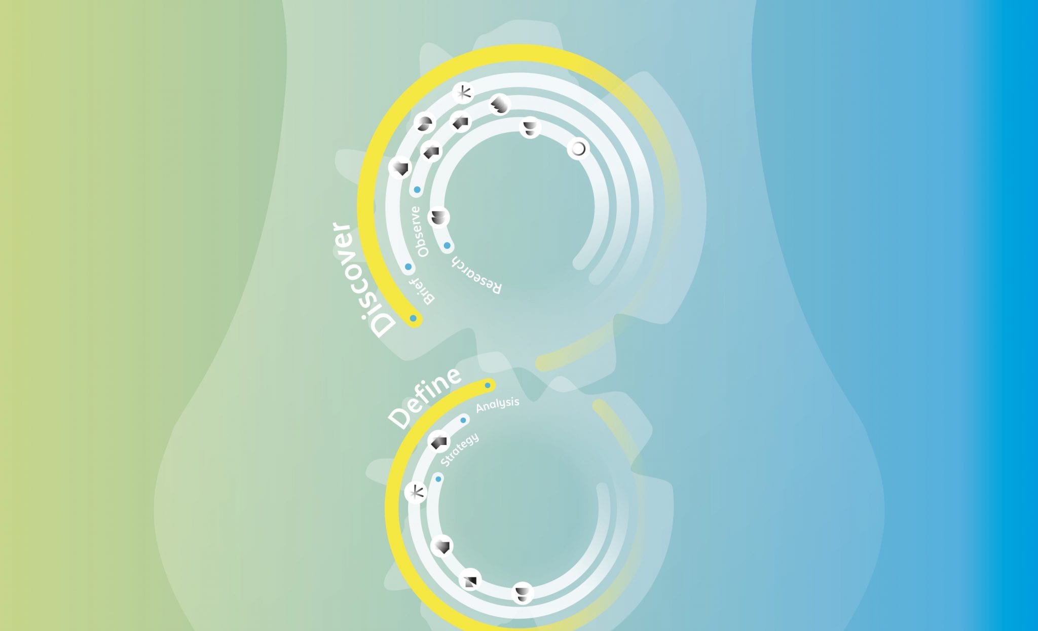
Oscillate scripted, storyboarded and visualised a video to explain the "Glas" idea in Adobe After Effects.
We were tasked with creating a video animation which explains the process and encourages teachers to join up and engage their students.
The project explores eight main areas in the environment where this literacy could be improved: Air; Climate, Environment; Waste; Economy; Land; Water; and Nature. These areas are based on statistical research conducted by the Environmental Protection Agency (EPA). Aimed at the ease of use for both teachers and school children. Through vibrant, youthful design, to create a renewed form of awareness which moves away from “doom and gloom” mentality.

Marketing Materials.
Sustainable advertising.
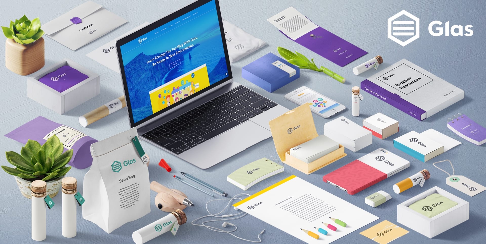
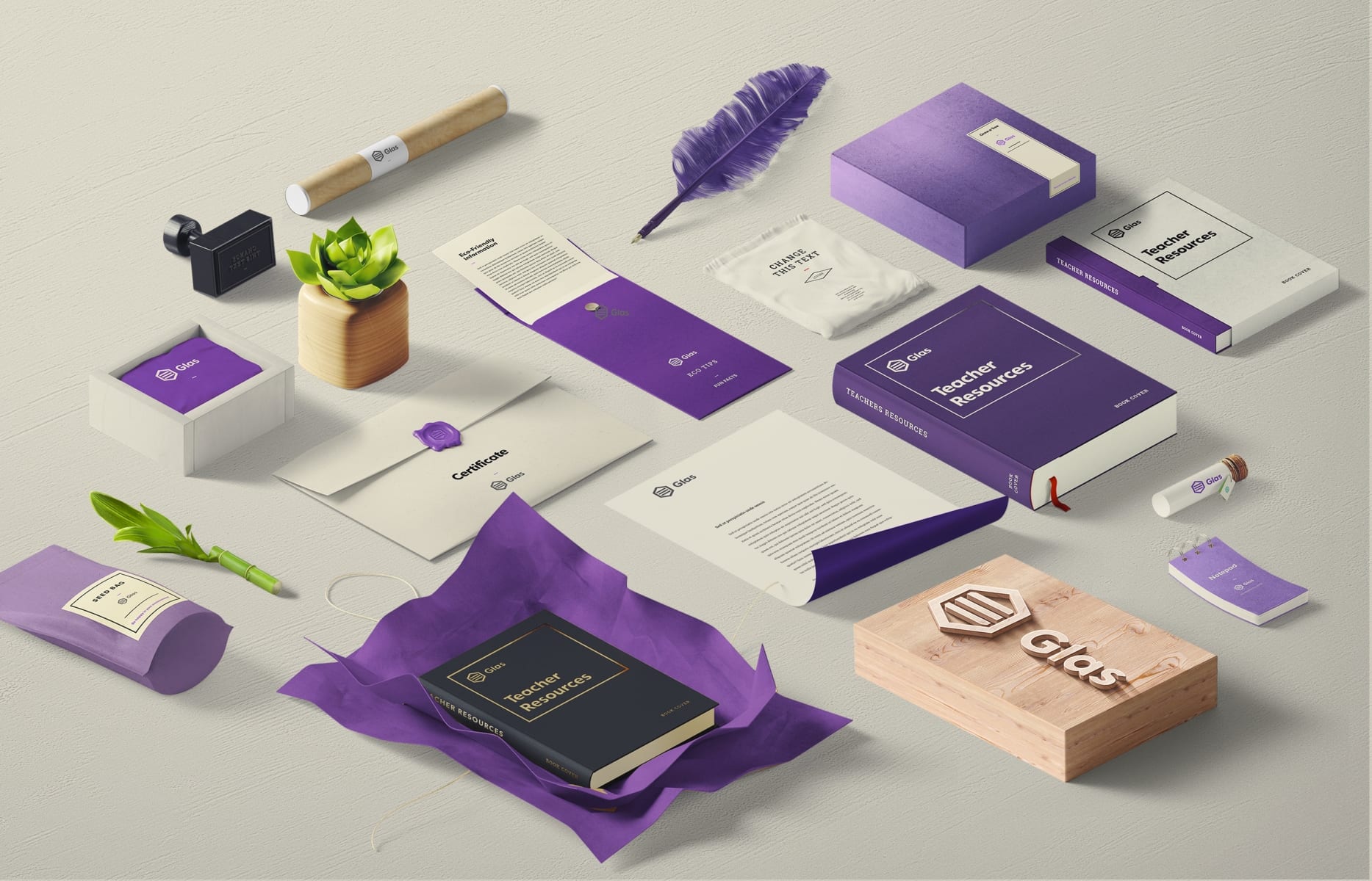
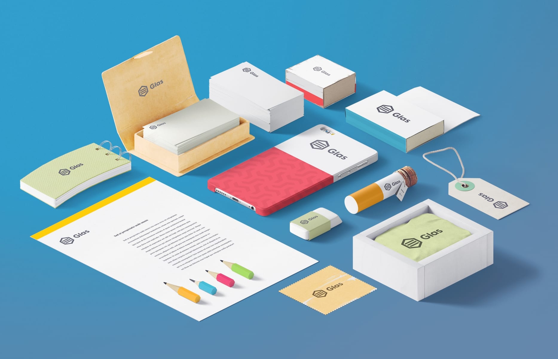
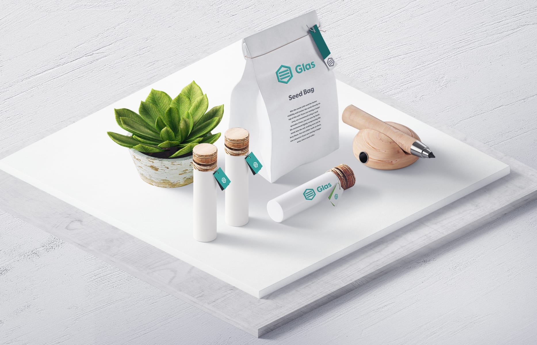
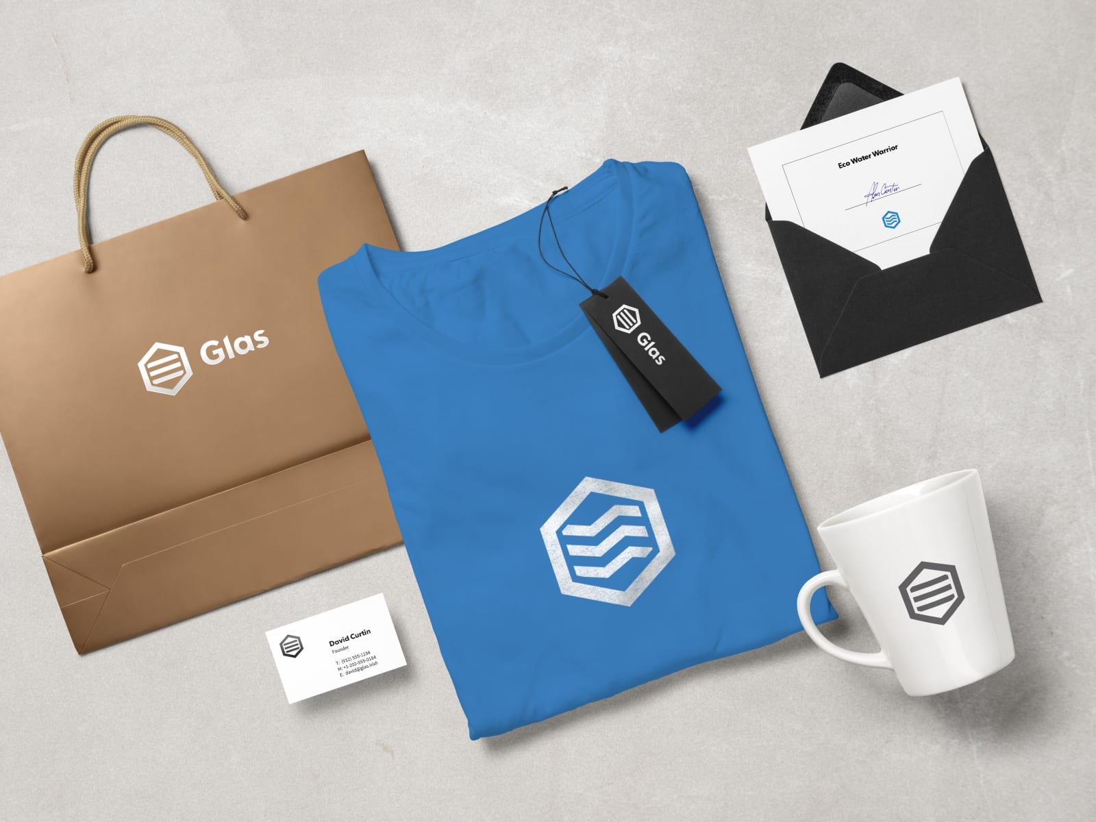
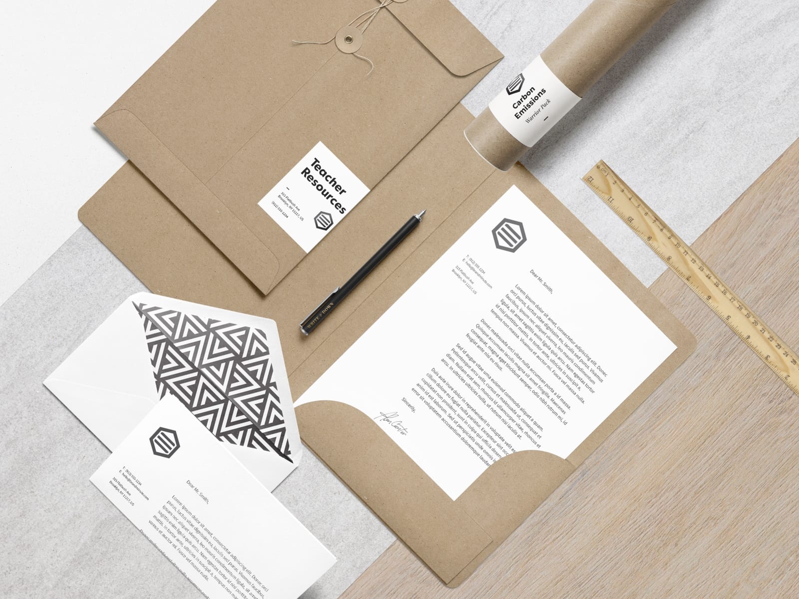
To market the concept, we produced a large portfolio of sustainable items, from t-shirts to envelopes to advertising.
Since the premises of this project is built on environmental education, the concept applying sustainable design and of making the packaging, prizes and printed materials from sustainable and durable supplies were a necessity.
Contact Details
Tel: +1 (778) 899 8400
Email: info@oscillate.ca
Address:
2901-131 Regiment Square
Vancouver
BC, V6B1X6
Get a Quote Now
About Us
We are a website, graphic & brand design studio based in Vancouver. We produce considered and beautifully crafted work across all platforms from print and web.
